Tuesday 30 September 2008

Fingerprint Book and Billy Harvey website


I found this website in a book I was reading called Fingerprint which is about graphic designs with handmade elements. This book is really inspirational to me because I really like very arty graphic design that can see that the brush strokes, the way someone put something together, and think it shows someone's spirit and love of what they are doing. 
This website is for Bill Harvey's music. I love the concept behind it. It's really interesting to move around it, with different polaroids connected and Bill Harvey moves between them. I like how you can watch his music videos online as well as listening to them. It's a very friendly website.

Video viral for the new samsung 'instinct' phone

This is a great engaging video. It has the perfect amount of user interaction to keep the user interested and effectively communicates all the key selling points of the product. For example the second video shows GPS tracking and map usage. This viral cleverly uses a very new Youtube feature to be the first video to viral of its sort on Youtube. It is a great combination of classic story telling, user interaction and new features on an extremely popular online environment. This video perfectly communicates key selling points demonstrated in the real word and it identifies its target audience ( young professionals.) I could only include the beginning video but It's so fun, give it a go!http://www.youtube.com/watch?v=HoOCiaxIZF4

Thursday 25 September 2008

Rothko


" I am not an abstract painter. I am not interested in the relationship between form and colour. The only thing I care about is the expression of man's basic emotions: tragedy, ecstasy, destiny. "
I went to the Rothko exhibition at the weekend at the Tate Modern. I was slightly disappointed as I didn't realize it was just his later work but it was still really enjoyable. Rothko is known for his signature style of stacking vertical fields of colour in layers; I'm so inspired by how there was so much progression and transition in each piece of work. I love how his work was influenced by myths and philosophy such as Freud.  I love the layout of each of his paintings and wonder whether you could use it graphical pieces?
Thoughout the late 1950s and 1960s Rothko explored the concept of his colour field from previous years. This interest emerged, in part, from various commissions to create ambitious paintery environments. For example for The Four Seasons restaurant in New York - The 'Seagram murals.' 
As you move around the 9 rooms you see that he begins to darken his palette because he hated that people thought his work was decorative.  For example the colours become more subdued- blacks, reds, maroons. 
It was amazing to see 14 of his red series in one room. They were so calming and engaging due to their size and extradonary array of tones. Part of the exhibition allowed you to see through special dyes on samples of the work so that you can see how many different layers of colours he used. 
I also really liked seeing his Black-Form paintings as they are so different. He uses a radically different deployment of colour, and also much more defined edges.  Although they all seem solid black there is so much texture to them and I love the way they reflect the light. 
The first picture is my favourite one of his paintings as it always reminds me of being young and going to see it with my Dad. If you stare at it for long enough the purple rectangles disappear!

Agencynet


This interactive website is unbelieve. It is so detailed and so much fun to look around. Agency net produce amazing websites for very famous brands such as Bacardi and are based in America with a new office in New York. 
The home page is a pretend office, where the figures move and you go onto different sections by clicking on the different rooms. All the pages are so unique; the page with a list of clients on it has a clock that actually moves and tells you the time! The page with news(the last one) has a highlighter pen that comes up so you can do the crossword! They look like so much fun to work for and really talented. 

Wednesday 24 September 2008

Weapons of choice- Fatboy Slim

Such a simple concept in reality but works so well. I love music videos with dance routines and this one is so unique. 

Spencer Tunick

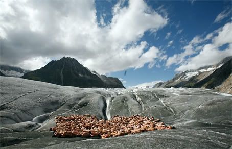
US-Installation artist Spencer Tunick and Greenpeace present a living  sculpture: hundreds naked volunteers symbolise the vulnerability of  the glaciers under climate change.
Spencer Tunick has been doing nude installations since 1992 in the USA and abroad. I remember watching a documentary a while back on his work which included conversations with the volunteers and I thought how interesting it was to get the public involved in art like that.  Last year he did some work with Greenpeace to promote awareness of global warming. He got hundreds of people to pose for photos on a glacier. A lot of people wondered as to how this tactic would help. “Receding glaciers are a clear indication of climate change, and Switzerland is especially affected. The installation will symbolize the vulnerability of the disappearing glaciers and the fragility of the human body. The images of the installation are intended to stir up emotions and to emphasize the naked truth: we have to act now.” - Greenpeace. I think he is clever to have chosen a way to express his creativity which is hard to copy, as everyone will always know it was him who did it first; so he'll always be unique. I don't think that it is the actual shapes of the bodies, or the fact that they are naked that make the pictures interesting but the different colours. They remind of when I saw hundreds of flamingos migrating in Africa a couple of years ago!

Atonement

I loved this story, which was written by my friend's dad, Ian Mc Ewan, when I read the book. I think that it a great adaption of the plot and doesn't change too many things in it. I love a film that has some kind of emotional affect on me, and this one definitely does; it engages you heart. It was shot so well, every scene seems so complete and fulfilling and the scenes of the war are especially so real. You really can feel all of their pain through the tragic consequences of one little girl with a powerful imagination believing something that didn't happen. It stars Keira Knightley and James McAvoy and won an oscar. At the end of the film your left with the question then whether one of them did achieve atonement or not, and how you feel about that- angry or sympathetic.

Jeppe Hein

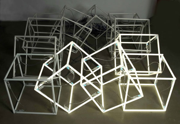
 Jeppe Hein - Shaking CubeJeppe Hein, NeonWall
I thought that after seeing and placing the blog on about Jeppe Hein's appearing rooms, I'd have a look at some of his other work, and discovered I really love some other things he has done.  He is a Danish artist who is now based in Berlin and has had international success especially with his performative installations. I have included some of the pieces which I really like. 
I love the spiral Labyrinth which I think is in the Tate modern?, so if it is i'd like to see it next weekend when I go to see the Rothko exhibition. A lot of his pieces explore the relationship between the viewer and the artwork. His shaking cube has invisible field of motion sensors and so the work is impelled by the movements of the viewer. His neon wall switches off as the viewer approaches.  "One side of the wall is interactive. If you walk along the wall, the neon modules turn off - one after the other. As they turn on and off the light modules change from a live, healthy, humming luminescence to a dull, cloudy object but the moment the visitor leaves, all of the neon lights are restored again."

Fountain displays- Heathrow T5, Bellagio hotel, Jeppe Hein's appearing rooms.


Over the summer I worked for a company that meant that every week I would have to go to Heathrow airport for the day. The highlight of it was that I loved to go see the fountain display at terminal 5. It was just bursts of water that went up and down at different heights but it was mesmerizing. I once saw a child walking straight down in between two lines of them and waving her hands up and down; so that it looked like she was controlling them- it was really beautiful!
I also remember how amazing the display was at the Bellagio in Vegas. It was just on an enormous scale, and it looked like the water was dancing.  
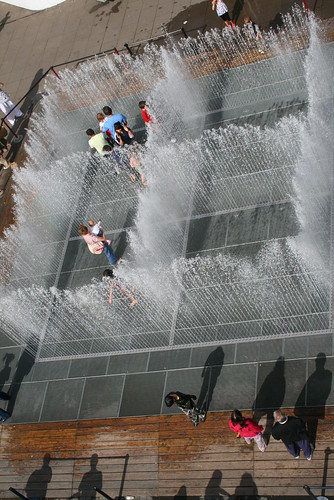
Last week when I was in London, I also went to see the Jeppe Hein, the Danish artist's, appearing rooms at the Southbank centre. It was originally commissioned for the garden of the villa Manin in Italy. You are able to enter into the sculpture, darting the water. He wants you to interact with the 'changing spaces,' as the walls of water rise and fall. This was so great to see as it was a step forward in an idea after seeing the girl at Heathrow and it was really fun. "This public artwork explores the relationship between spatial perception and memory, presence and absence, inside and outside. "


Juliette has a gun

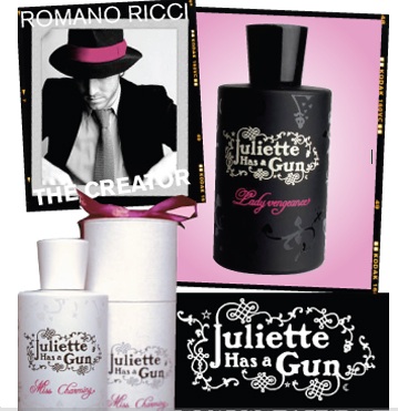
I had seen an article on this perfume a few years ago and then saw the actual product recently. I really like the design of the bottle; it has a really nice finish on it and the logo which is fairly intricate but stands out due to the simple colouring, but I especially like the whole concept behind it. It was founded by Romano Ricci who is the grandson of Nina Ricci who was inspired by Shakespearean heroines.  He says in an interview that it is for the "dominant femininity," who can play at "femme fatale." Each other the perfumes has it's own personality which I think really appeals to woman as it makes them believe that they can match it to their own. I think the website is also really nice, and I have included two of the personalities for you to read about them below:

" A new way to look at perfumery, both rock and elegant, liberating from conventions and explores new territories." 

Miss Charming: The perfume of a virgin witch, docile and provocative, elegant and sensual. One instant, holding up the pressures of the world and the next, crying hot tears over the death of Enzo, her bowl fish! A fragrance that makes up ingenuousness and lucidity.

Miss Vengeance: A perfume with a rich and sophisticated trail. The expression of undeniable femininity, confident and divinely sensual. The fragrance of a lady for whom the art of seduction bares no secret. You can smell.. you can dream... but it's a in her hands. 

Tuesday 23 September 2008

Cavan Huang


I'm a huge fan of his, especially of his prints for  "Dusk" typographic concrete design poem and the Harlem Document project( the first print.) His also does some really cool motions. The way his website is set up also makes it really easy to view all his different pieces and I really like the way his describes his pieces of work. For instance the second one is the result of a twelve week explorative process. And it is in response to an assignment to visually transcribe audio narratives; his is a passage of slurred speeches from street drunks. 
I've learnt from his work that you can have a certain individual style to your work, as he does, but it is important to be interested and produce different ideas too, especially if the criteria is not really to your style. You can see this especially in his videos. Unfortunately I couldn't get them to download.
http://www.icav.ca/motion_06.htm

100% Design London: Mint's 10th Anniversary Show


I went to Mint in London on Widmore Street who are running an exhibition from the 18th to 30th September. The exhibition 'forget me not' is part of London Design Week and is to celebrate it's 10th anniversary. I went because my friend who has just graduated from Bath was showcasing her ceramic handbags. I think they are so beautiful; some have chains on them and big shiny buttons, others are made so they look like they are slouchy. We've been talking recently about how to take some good promotional photos of them; maybe with a girl trying to drag one to mimic the saying " I've got my life in this handbag, its so heavy!"
There were some other amazing pieces; I loved Laura Cahill's furniture made out of recycled books and Felicity Lloyd Coombe's cute sculptures. There was also an installation by Dutch designer Marije vogelzang where she used traditional clay cooking methods to build sculptures, bake vegetables such as onions and then break them to create a " sensory dilemma."

Test your fire Alarm


I think advertisements that use household named, comedians to promote a message that is serious often works really well. It makes you stop and listen; if it is something they are bothered about that isn't making them happy or funny then it must be something important. I think that this advert works because it really captures your attention and relates to you sitting there watching the adverts in between your programme. It also makes you feel guilty and you want to go check your fire alarm because it is something you could be doing there and then, in the break. The adverts were done by an agency called Euro RSCG and I particularly think the second shorter one is more effective.


Vegas Baby


Vegas is one of the most surreal places I have ever been to. It is so true what people say about it; that you drive for hours to get there, in the pitch black with nothing around you and then suddenly you see a burst of lights and the biggest buildings I have ever seen. The hotels are all so unique and bizarre, all so beautifully, intricately decorated. For instance the New York New York hotel has separate buildings mimicking famous buildings in New York and a roller-coaster going all the way around them. I also found the darker side of Vegas quite interesting as well; the men on the streets giving out cards for prostitutes because its legal, the way you can go shoot guns at the gun store, the strange stories you would hear about builders on new hotels going up, dying each day because they have no ropes holding them; the tourists below so unaware. I also loved their bold advertising they used for promotions and clubs! ( seen above.)

Monday 22 September 2008

Metamorphosis- Franz kafka

The Metamorphosis is a short novel by Franz Kafka. The opening sentence is one of the most famous in literature;

“As Gregor Samsa awoke one morning from uneasy dreams he found himself transformed in his bed into a monstrous vermin.”

Like the opening line suggests; it is a story of a young man who is transformed into a giant cockroach overnight. It is a story of alienation, about feelings of inadequacy- as the cockroach is not recognized and disgusted by his family and unable to talk- so banished to his room. You are never told why he becomes an insect, he wonders whether it is an illusion from working too much. It shows the kinder side of humanity, as you see his family begin to change their ways, and it also gets a message across about looking after ourselves and not working too hard. It is really dark and quite hunting yet surprisingly funny and has a lasting effect on you. 

Whatever you think, think the opposite. Paul Arden


Paul Arden is a former executive creative director at Saatchi & Saatchi at the author of the international bestseller "It's not how good you are, it's how good you want to be." This book is about unconventional, sometimes outrageous thinking; he does not tell you what to think or believe but gets you to challenge what he tells you and the way you view your life and opinions. It's a small, witty book but with huge ideas and I really recommend everyone to have a copy to once in a while flip through. 

DECISIONS
DECISIONS
DECISIONS
Whatever decision you make is the only one you could make.
Otherwise you would make a different one.
Everything we do we choose.
So what is there to regret?
You are the person you choose to be.

ARE YOU BEING REASONABLE?
Saloman Brothers, the well-known New York investment house, met with prospective clients not once a month or once a day, but three times a day.
That is unreasonable.
But it works.
Most people are reasonable, that's why they only do reasonably well.

Sunday 21 September 2008

Nigel Coates- Scubism

I went to see Nigel Coates new range of furniture for Fratelli Boffi today at Chaplins Furniture which blew me away. There are 22 pieces and I especially liked the chairs. It is part of the London Design Festival which has been on since the 13th. He is a very unique and spontaneous designer who does not only do interior design but also product design and architecture. "Scubism avoids coordination for its own sake. It combines mischievous imagination and traditional skills." I love the sumptuous and colourful fabric used, and bizarre shapes that the timber is sculptured into; ways in which I would have never has imagined; which I feel has a real feel of copying bodily poses and a great twist on Cubism. 
" Why not fragment structure and defy gravity?"

Beyond Borders

Angelina Jolie and Clive Owen star in this film and I think it deserved more credit and recognition than it got. It is about humanitarian relief and despite the poor love story this film aims to shock by using very real scenes of desperation and poverty. This film has such an affect on me as it reminds of how I'd like to one day do some work for Charities regarding their marketing and advertising, and I believe it is just so well shot and goes far beyond any other film in trying to get a message across. This isn't the trailer but it shows some of the better scenes. 

Jenny Saville

Jenny Saville is a British born artist who's focus has mainly been on female bodies. She has been compared to Lucian Freud and in 1993 Saatchi purchased all of her work. She paints in a way that views the architecture of the body; her paintings become a sort of sculpture. Some feature target rings which help to give a feel of shape and form and mark making causes you to move around the painting and few all aspects of the skin. She paints how woman see themselves, and there is a sense of frankness and vulnerability in them which I love. I believe she was right when she said;"I want a painting realism. I try to consider the pace of a painting, of active and quiet areas." 

Knucklehead


I really like Knuckleheads simple design of it's website. I think the way you can view each directors work by clicking on their signature is really inventive and more personal to the viewer. The text that goes with each director follows in this theory by being very jokey and each piece ends with a sentence that describes how they are a knucklehead.  The directors are some of the most talented people around and have done some of the most well known and loved adverts. One of my favourite adverts at the moment was done by Johnny Green- The Mercedes Benz Ambition advert.  Here is an example of the text for one of the directors:
"Daniel went to st martins school of art and of course was a star and then went and did some title sequences which everyone went on and on about and won lots of things which made his mum happy and then of course commercials came calling and that was all great and he made about a zillion commercials and won tons of things which all sat in his office next to the picture of the naked man which we all know is art really and he claims he can play the trumpet though we've never seen it but he probably can because he's a knucklehead."