Thursday 2 October 2008

Chris Nash

Chris Nash is one of the UK's best dance photographers. Each project he does is so different and he always captures so much emotion in the dances. I like the colours in the photographs and the gracefulness and dream like state of them. 

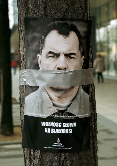
Amnesty International campaign

I'm not a huge fan of ambient media, not because I don't think it's a great way of advertising or grabbing the public attention- I just think it's too over used. It is however hugely successful when used with Amnesty International as many people try and ignore the problems in the world and by placing it directly in our environment it makes you think and feel guilty about not doing anything. It also makes you think about how lucky you are with the messages it sends by putting the people that are suffering in your environment for that minute you see it. 

Kings of Leon performances

I saw on the television in the summer Kings of Leon perform at Glastonbury. I'm captivated by the way that they perform; they create such a mood. I really think the lighting and back display worked perfectly with their music. I also think that their music video Sex on Fire, although fairly simple sums them up really well and the people that directed it really listened and understood who they are.


Build Graphic Design & Art Direction


I really enjoyed looking at Build's showcase. I really like that they believe in producing beautifully crafted design which all are also really clean looking. For example they have applied this to the Pritt corrector pen advertising and the custom made typefaces.

Wednesday 1 October 2008

Monoface website


This website is so much fun; you can change parts of the face by clicking on it! im not sure what its for I love it. You could use this kind of concept as an interactive piece of advertising. Maybe ambient media. http://www.mono-1.com/monoface/main.html

Creative Advertising- ideas and techniques from the world's best campaigns.

Creative Advertising: Ideas and Techniques from the World's Best Campaigns
This book is so helpful not only as a reference book but it has some great written advice about the creative process. After giving a good couple pages of advice about working, it breaks the showcase of adverts down into different chapters about practical methods of creating unforgettable adverts.  For example doing one without words, repetition and accumulation and a change of perspective. At the beginning it has lots of questions you can ask about your product and then with each advert it has a kickstart question to get you thinking about how and why it works so well. This book is just what I needed to help me with my work. I have included some of the pieces of work that caught my eye. 

Cashino Royale opening sequence

I love the opening sequence partly because of the mixture of animation and film. I love how inventive they were with the different ways to turn the 4 card shapes into things and how detailed it is. I love how they have included typical casino print as well. It all links together so well and keeps you engaged. I love all the cards exploding at the end. 

The Tate Britain- Francis Bacon

I wasn't a huge fan ever of Francis Bacon but the exhibition at the Tate Britain was so well set out and his work is overwhelming. I had an audio guide which was so educational.  I could relate to how he loved to tear photographs and pictures from magazines or newspapers and draw on top of them. I loved seeing all the different photos that he would take or be inspired by.  And also to how he was an atheist and was intrigued by his representation of what it would be like to live in a world without God or afterlife. I love how much of his emotions were put into his representations of the figure. There is so much tension, hopelessness, desperation and  isolation; the paintings haunt you like a nightmare with figures trapped in the scene or line boxes.  I love how he would slightly distort on some, and then completely on others such as his crucifixion paintings. It was interesting to learn of how he would paint vertical lines on the paintings to make it more dream like and feel like there was movement and his obsession with the Velazquez's portrait of Pope Innocent X c 1650. The  These were some of my favourite ones, and are probably not the ones that are usually conventionally associated with Bacon.

Georgina Goodman promotional campaigns from the book Great British Editorial.

+ ZOOM


This book is wonderful as it has a huge selection of editorial design projects from Great Britain from magazines to brochures. It explains their trade secrets and their different personalities and is a great reference book.
I really loved the fashion designer Georgina Goodman's promotional campaign. It was done by Zulma Covers. I love the way the catalogue opens; and I love the simplicity of the pages in the small book. I think the pages are engaging and the art work doesn't over power or take the attention away from the pictures of the shoes. 

Tuesday 30 September 2008

Fingerprint Book and Billy Harvey website


I found this website in a book I was reading called Fingerprint which is about graphic designs with handmade elements. This book is really inspirational to me because I really like very arty graphic design that can see that the brush strokes, the way someone put something together, and think it shows someone's spirit and love of what they are doing. 
This website is for Bill Harvey's music. I love the concept behind it. It's really interesting to move around it, with different polaroids connected and Bill Harvey moves between them. I like how you can watch his music videos online as well as listening to them. It's a very friendly website.

Video viral for the new samsung 'instinct' phone

This is a great engaging video. It has the perfect amount of user interaction to keep the user interested and effectively communicates all the key selling points of the product. For example the second video shows GPS tracking and map usage. This viral cleverly uses a very new Youtube feature to be the first video to viral of its sort on Youtube. It is a great combination of classic story telling, user interaction and new features on an extremely popular online environment. This video perfectly communicates key selling points demonstrated in the real word and it identifies its target audience ( young professionals.) I could only include the beginning video but It's so fun, give it a go!http://www.youtube.com/watch?v=HoOCiaxIZF4

Thursday 25 September 2008

Rothko


" I am not an abstract painter. I am not interested in the relationship between form and colour. The only thing I care about is the expression of man's basic emotions: tragedy, ecstasy, destiny. "
I went to the Rothko exhibition at the weekend at the Tate Modern. I was slightly disappointed as I didn't realize it was just his later work but it was still really enjoyable. Rothko is known for his signature style of stacking vertical fields of colour in layers; I'm so inspired by how there was so much progression and transition in each piece of work. I love how his work was influenced by myths and philosophy such as Freud.  I love the layout of each of his paintings and wonder whether you could use it graphical pieces?
Thoughout the late 1950s and 1960s Rothko explored the concept of his colour field from previous years. This interest emerged, in part, from various commissions to create ambitious paintery environments. For example for The Four Seasons restaurant in New York - The 'Seagram murals.' 
As you move around the 9 rooms you see that he begins to darken his palette because he hated that people thought his work was decorative.  For example the colours become more subdued- blacks, reds, maroons. 
It was amazing to see 14 of his red series in one room. They were so calming and engaging due to their size and extradonary array of tones. Part of the exhibition allowed you to see through special dyes on samples of the work so that you can see how many different layers of colours he used. 
I also really liked seeing his Black-Form paintings as they are so different. He uses a radically different deployment of colour, and also much more defined edges.  Although they all seem solid black there is so much texture to them and I love the way they reflect the light. 
The first picture is my favourite one of his paintings as it always reminds me of being young and going to see it with my Dad. If you stare at it for long enough the purple rectangles disappear!

Agencynet


This interactive website is unbelieve. It is so detailed and so much fun to look around. Agency net produce amazing websites for very famous brands such as Bacardi and are based in America with a new office in New York. 
The home page is a pretend office, where the figures move and you go onto different sections by clicking on the different rooms. All the pages are so unique; the page with a list of clients on it has a clock that actually moves and tells you the time! The page with news(the last one) has a highlighter pen that comes up so you can do the crossword! They look like so much fun to work for and really talented. 

Wednesday 24 September 2008

Weapons of choice- Fatboy Slim

Such a simple concept in reality but works so well. I love music videos with dance routines and this one is so unique. 

Spencer Tunick

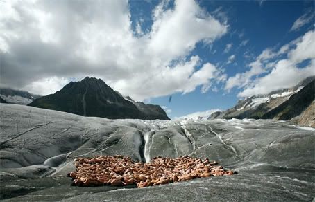
US-Installation artist Spencer Tunick and Greenpeace present a living  sculpture: hundreds naked volunteers symbolise the vulnerability of  the glaciers under climate change.
Spencer Tunick has been doing nude installations since 1992 in the USA and abroad. I remember watching a documentary a while back on his work which included conversations with the volunteers and I thought how interesting it was to get the public involved in art like that.  Last year he did some work with Greenpeace to promote awareness of global warming. He got hundreds of people to pose for photos on a glacier. A lot of people wondered as to how this tactic would help. “Receding glaciers are a clear indication of climate change, and Switzerland is especially affected. The installation will symbolize the vulnerability of the disappearing glaciers and the fragility of the human body. The images of the installation are intended to stir up emotions and to emphasize the naked truth: we have to act now.” - Greenpeace. I think he is clever to have chosen a way to express his creativity which is hard to copy, as everyone will always know it was him who did it first; so he'll always be unique. I don't think that it is the actual shapes of the bodies, or the fact that they are naked that make the pictures interesting but the different colours. They remind of when I saw hundreds of flamingos migrating in Africa a couple of years ago!